
2010-2018
Buffalo Sabres


THE STORY
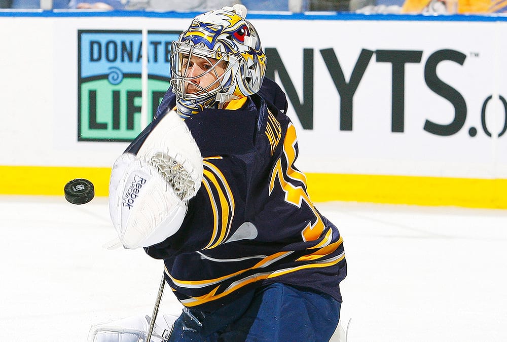
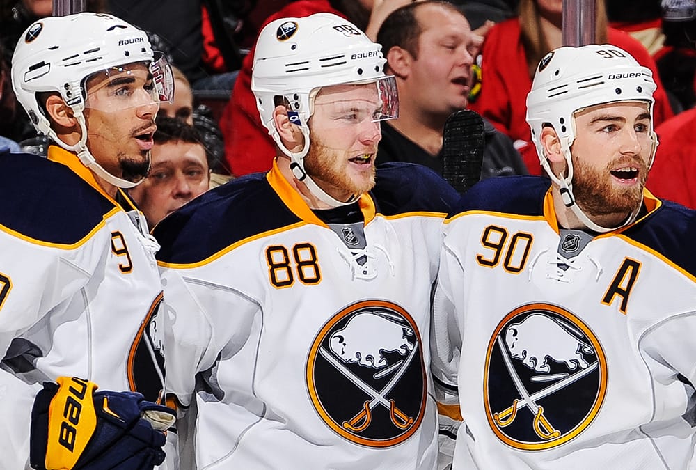
A mix of retro and modern, the Sabres turned the clock back while also maintaining a new feel with their new logo and uniforms introduced for the 2010-2011 season. The entire look was based on what the Sabres wore from 1970 through 1997, with the logo featuring a buffalo leaping between two crossed sabres inside a blue-and-gold circle. What had changed most of all was the colors; they were darkened across the board, with the blue going from a bright royal blue to a dark navy. Silver was also added to the color scheme and applied as a trim color on stripes, piping around the front and back, under each arm, and on the logo itself. Player numbers appeared in the upper right corner of the front of the jersey, an idea that had been adopted by four other teams in the league at the time. The Sabres made a change to this uniform for the 2017-2018 season removing the silver piping from the front and back and the patch of silver under the arms.